Lab 1B: Get the Picture?
Lab 1B - Get the picture?
Directions: Follow along with the slides, completing the questions in blue on your computer, and answering the questions in red in your journal.
Where'd we leave off ...
-
In the previous lab, we started to get acquainted with the layout of RStudio and some of the commands.
-
In this lab, we'll learn about different types of variables.
– Such as those that are measured by numbers and others that have values that are categories.
-
We'll also look at ways to visualize these different types of data using plots (a word data scientists use interchangeably with the word graph).
-
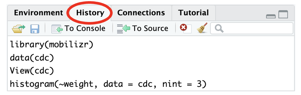
Find the History tab in RStudio and click on it. Figure out how to use the information to reload the
cdcdata.
Variable Types
-
Numerical variables have values that are measured in units.
-
Categorical Variables have values that describe or categorize our observations.
-
Viewyourcdcdata and find the columns forheightandsex(use the History pane again if you need help toViewyour data).– (1) Is
heighta numerical or categorical variable? Why?– (2) Is
sexa numerical or categorical variable? Why?– (3) List either the different categories or what you think the measured units are for
heightandsex.
Which is which?
- Run the code you used in the previous lab to display the
namesof yourcdcdata's variables (use the code displayed in the History pane to resubmit previously typed commands).
-
Use the code's output to help you complete the following:
– (4) Write down 3 variables that you think are categorical variables and why.
– (5) Write down 3 variables that you think are numerical variables and why.
Data Structures
-
One way to get a good summary of your data is to look at the data's structure.
– One way to view this info would be to click on the little blue arrow next to
cdcin the Environment pane.– Another way would be to run the following in the console:
str(cdc) -
(6) What information does the
strfunction output? -
(7) Were you able to correctly guess which variables were categorical and numeric? Which ones did you mislabel?
Visualizing data
-
Visualizing data is a really helpful way to learn about our variables.
-
(8) Choose one numeric variable. Write and run codes to create a
bargraphand ahistogram. -
(9) Choose one categorical variable. Write and run codes to create a
bargraphand ahistogram. -
(10) Which function, either
bargraphorhistogram, is better at visualizing categorical variables? Which is better at visualizing numerical variables?
We have options
-
(11) Write and run the code to make a graph that shows the distribution of people’s
weight.– (12) Describe the distribution of
weight. Make sure to describe the shape, center and spread of the distribution. -
Options can be added to plotting functions to change their appearance. The code below includes the
nintoption which controls the number of intervals in a numerical plot.– Options, also known as arguments, are additional pieces of information you provide to a function, and are separated by commas.
– Type the command below on your console and then answer the questions that follow:
histogram(~weight, data = cdc, nint = 3)– (13) How did including the option
nint = 3change thehistogram?– (14) Does setting
nint = 3impact how you would describe the shape, center and spread?– (15) Try other values for
nint. What value produced the best graph? Why?
How often do people text & drive?
-
(16) Write and run the code to make a graph that shows how often people in our data texted while driving.
– (17) What does the y-axis represent?
– (18) What does the x-axis tell us?
– (19) Would you say that most people never texted while driving? What does the word most mean?
– (20) Approximately what percent of the people texted while driving for 20 or more days? (Hint: There are 17,232 students in our data.)
Does texting and driving differ by sex?
-
(21) Write and run the code to make a side-by-side
bargraphthat could answer this quesition: Does texting and driving differ by sex? Use the following fill-in-the-blank code as a hint.bargraph (~____ , data = ____, groups = ____) -
(22) Write a sentence explaining how boys and girls differ when it comes to texting while driving.
-
(23) Would you say that most girls never text and drive? Would you say that most boys never text and drive?
-
(24) How did including the
groupsargument in your code change the graph?
Do males and females have similar heights?
-
To answer this, what we'd like to do is visualize the distributions of heights, separately, for males and females.
– This way, we can easily compare them.
-
(25) Write and run the code to create a
histogramfor theheightof males and females using thegroupsargument.– (26) Can you use this graphic to answer the question at the top of the slide? Why or why not?
– (27) Is grouping numeric values, such as heights, as helpful as grouping categorical variables, such as texting & driving?
Do males and females have similar heights?, continued
-
Why does this work for bargraphs but not histograms?
– The
groupsargument uses color to differentiate between groups.– With bargraphs, each group is split with bars next to each other on the x-axis.
– With histograms, the x-axis is a continuous set of numbers so the bars overlap making it difficult to compare center and spread.
-
(28) Write and run the code to create a split
histogramto answer the questions below:histogram (~ ____ | ____, data = ____) -
(29) Do you think males and females have similar heights? Use the plot you create to justify your answer.
-
(30) Just like we did for the
histogram, is it possible to create a splitbargraph? Write and run the code to create abargraphofdrive_textthat is split bysexto find out.
On your own:
-
In this lab, we looked at the texting & driving habits of boys and girls.
-
(31) What other factors do you think might affect how often people text and drive?
-
(32) Choose one variable from the
cdcdata, make a graph, and use the graph to describe howdrive_textuse differs with this variable.